
Hook & Ladder Manufacturing Co.
Restaurant & bar
Client: Modrow-Bazett Inc.
Location: Sacramento, CA
Fall of 2013 was a pivotal time when Sacramento was blooming with restaurants and bars that have true passion about their craft. Modrow and Bazett just signed the lease on a space within the ground floor of an airplane hanger in downtown and needed a concept, name, logo and marketing voice. Hook & Ladder is a nod to a volunteer fire group that helped rebuild the city after a series of fires during the Industrial Revolution. H&L represents the bountiful harvest California has to offer and the proud city history the new pioneers continue to shape by embracing local farms, ranches, breweries and wineries in both their kitchen and their bar.
Deliverables
Name
Visual Identity
Exterior Signage
Marketing Voice
Business Cards
Menus
Flyers
Photography:
Carolyn James
Brand Identity
The icon and logotype for Hook & Ladders branding were derived from the Industrial Revolution concept and the corrugated metal found on the exterior of the airplane hanger. The icon has vertical lines to reference the metal, a horizontal bracket affect with adjacent screws and the entire badge feels like a gear or circular saw. The logotype has industrial serifs and a custom ampersand to mimic a hook. The palette consists of de-saturated steel colors that contrast on the food and beverage photography to balance the identity.
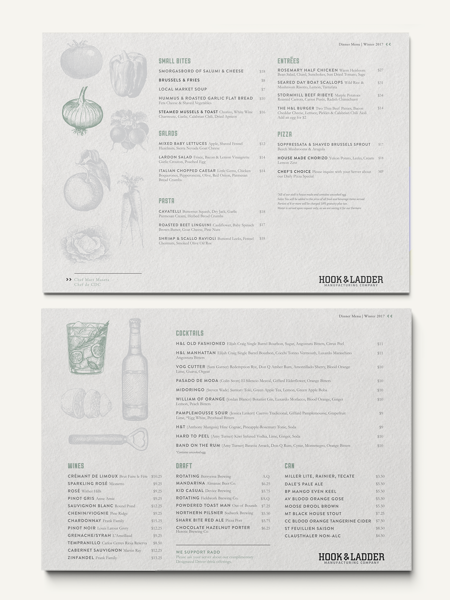
Menu Design
The menu design aesthetic is meant to feel clean yet still slightly industrial. The light greys in the text and illustrations honor the brand identity. As a farm-to-form concept, the menu shifts ingredients throughout the year. To highlight this shift, a single illustration appears in the appropriate color to celebrate the bounty of the season.


Preliminary Photography
We stylized and directed a photoshoot of the cocktails, bar tools and food for our preliminary marketing material. Pasta was lined up as if it landed on a conveyor belt, bitters was arranged as towering ingredients and the bar tools (our favorite photos) were arranged as if they came from an artisanal workshop.

Marketing Design
Fonts and artwork from the Identity Style Guide are utilized in the ongoing Event Flyers we design.


Additional Branding
These are some of our favorite business cards to date: printed on linen with UV spot coating on the logotype - Patrick Bateman would be obsessed. The design style is reminiscent of an old-school time card or form, with labelled cells to add information in using a hand-written font. Our favorite feature is the side barcode where we hid the employee’s cell phone # in order to create a small level of privacy.
Another favorite application of the logo was on an electric branding iron that was used to caramelize citrus oils for cocktail garnish. Not only does it look good, but it smells great too!