The Butterscotch Den
SACRAMENTO, CALIFORNIACompliments to the Chef!
A neighborhood bar at heart that aims to bring hospitality back to this refreshed space. The bar flip of Arthur Henry’s Ruby Room provided us with the right bones to update to a high-volume “captured in time” concept. We reconfigured the bar service wells, gave a makeover to the walls, updated the lighting palette, re-designed the backbar and provided a retro 1970s face-lift to bring this ready-to-grill BBQ concept back to life.
PROJECT• Interior Design Refresh
Back Bar Design, Updated Paint + Wallpaper,
Wall Art, Updated Lighting
• Brand Identity
Logo, Brand Marks, Font + Color Palette,
Marketing Direction, Brand Voice
• Menu Design
• Guest Touchpoints
Coasters, Gift Cards, Deli Sheets
• Merchandise
T-shirts, Martini Glasses
• Employee Portrait Collages
PHOTOGRAPHYPARTNERS

CONCEPTUAL MOOD BOARD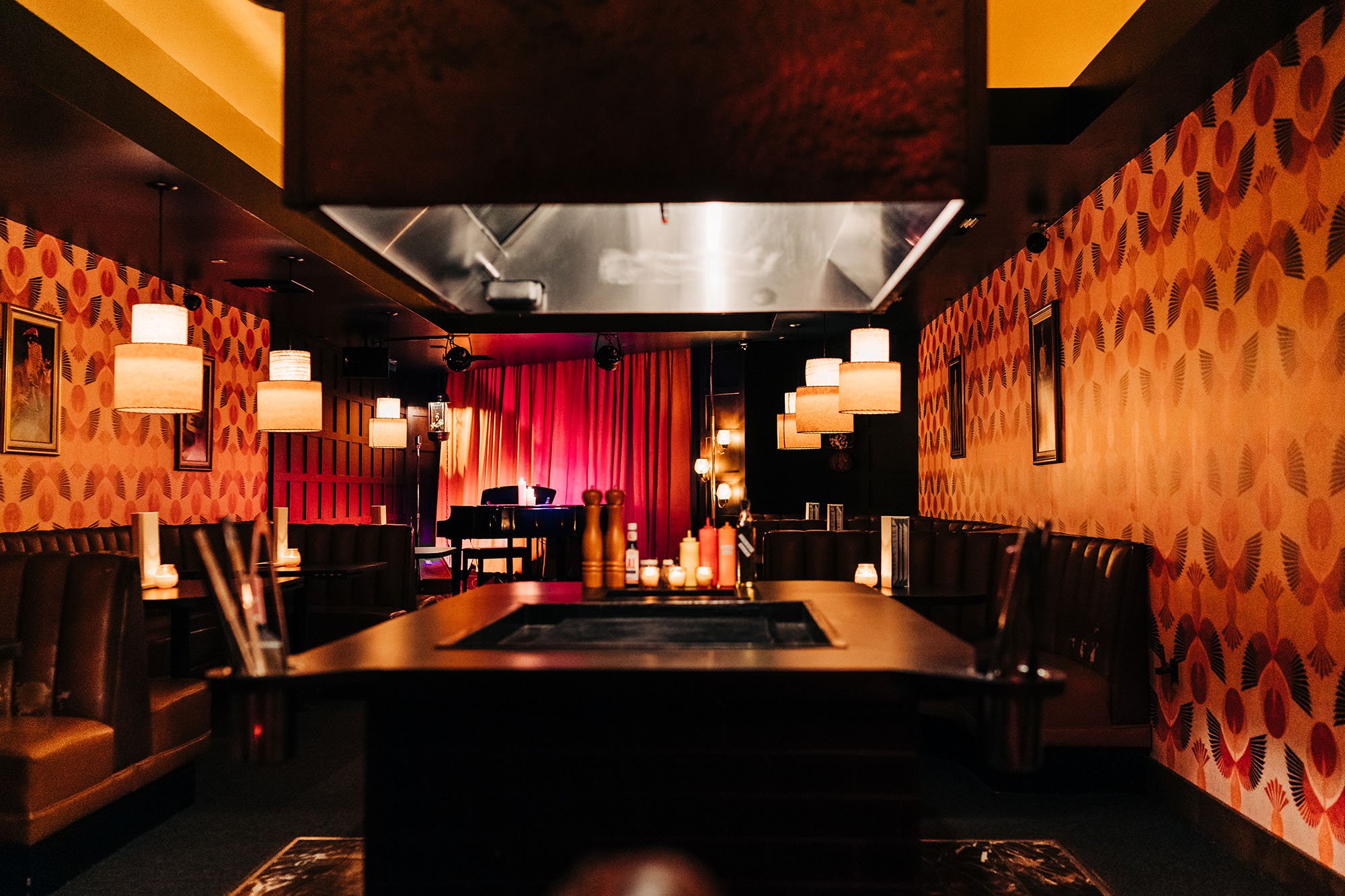


Project Background
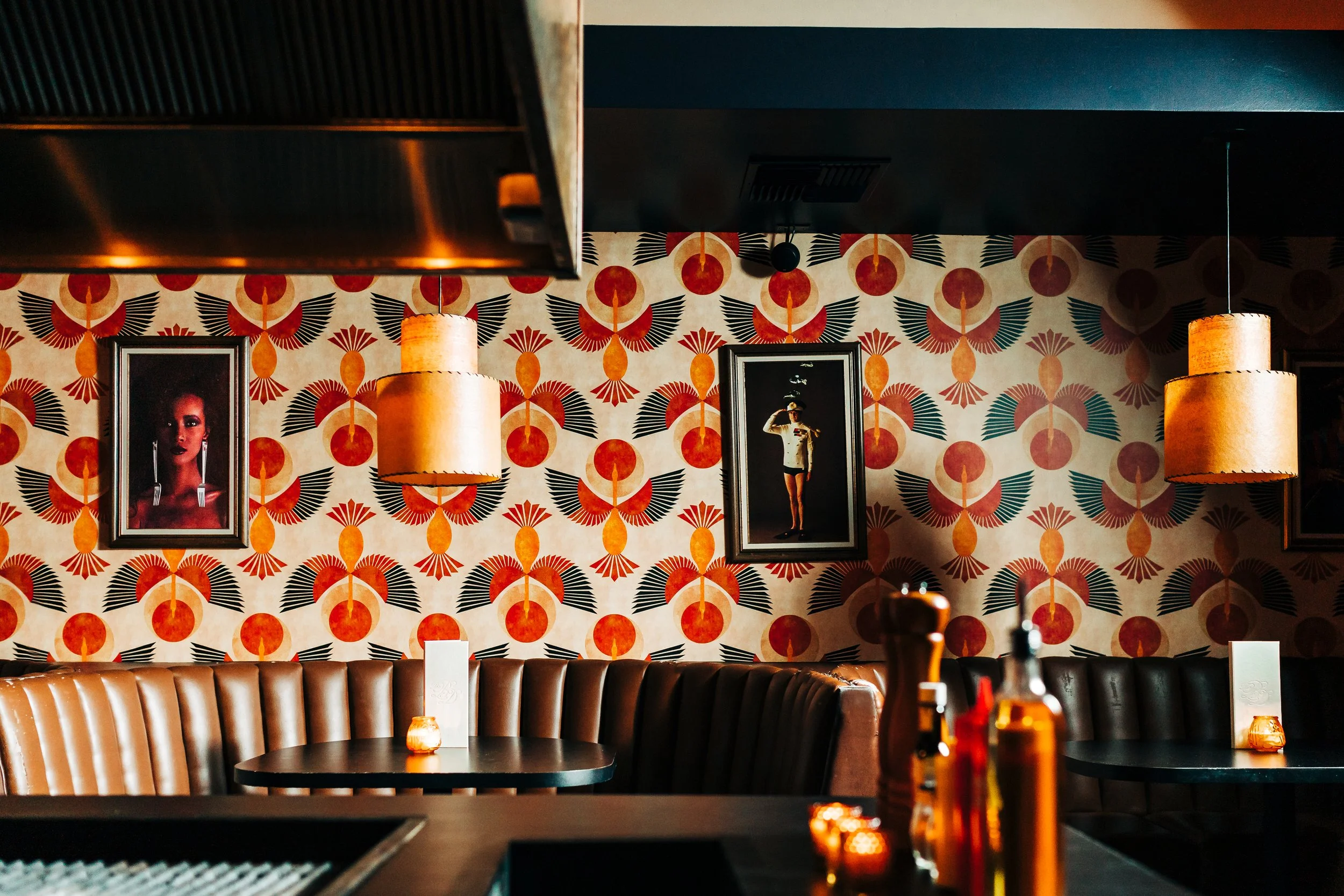
When the restaurant group took over, the budget was tight and the pandemic’s shadow still lingered. Luckily, the bones were already perfect for a transformation — the space had been modeled after one of our all-time favorites, the Turf Supper Club in San Diego, a beloved mid-century dive. That spirit became our north star: create a retro steakhouse that feels like it’s been here for decades, weathered yet full of character.
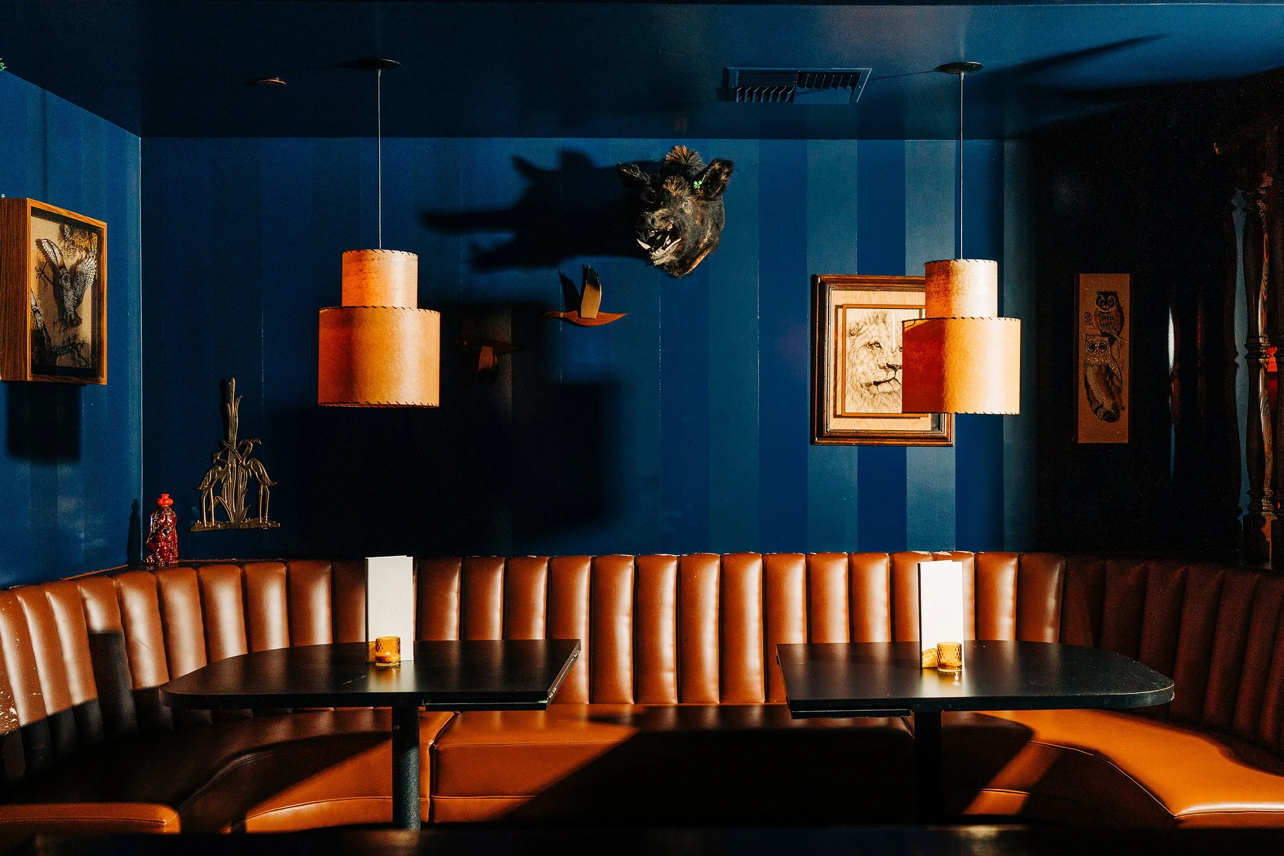
Instead of starting from scratch, we leaned into the imperfections. The threadbare carpet stayed. The cracked faux-leather booths stayed. We let those tell the story, channeling our energy (and dollars) into bold, strategic touches. In the dining room, a splash of loud 1970s wallpaper became our single indulgence — found, of course, on sale. In the bar, we played with texture, striping navy blue walls in alternating gloss and eggshell finishes so light dances across them. To open up the cavernous space, we mirrored the back bar wall and topped it off with a custom logo in the style of vintage beer mirrors. The result? A space that feels like it’s been holding court for fifty years, with just enough sparkle to keep things interesting.
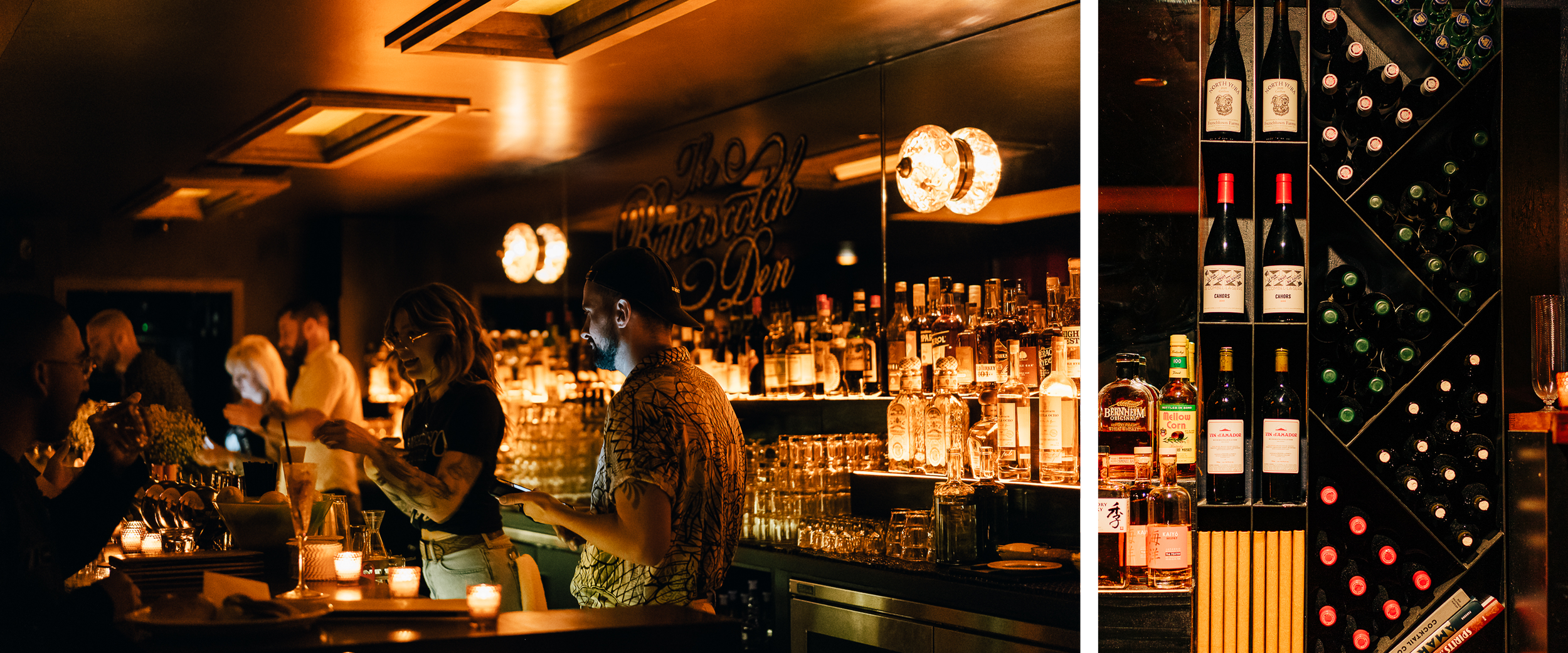
Making the Back Bar Pop!
The back bar from the previous occupants was under-utilized, so we embraced true dive bar stylings and created custom shelving with Age West Industries for dynamic wine bottle display & storage and stepped shelves to showcase the extensive liquor collection. The back bar liquor shelves were lit using LED light strips in a channel beneath yellow tap plastic strips to highlight the bottles with a golden glow.


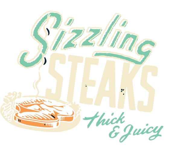
Brand Identity
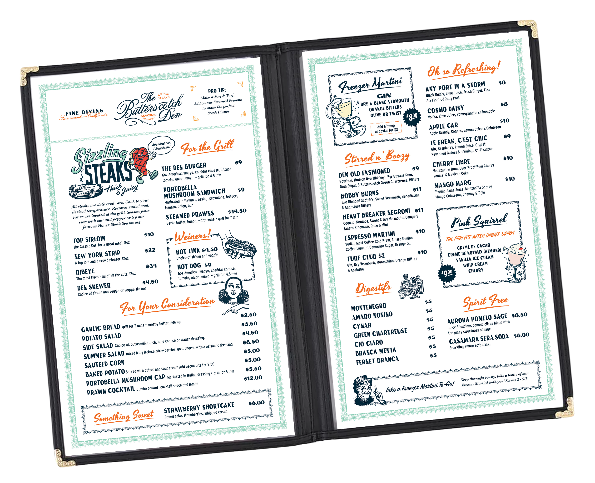
The Brand Identity is composed the main logotype with or without the informative taglines “Ready to Grill Steaks” and “Martinis Served Ice Cold.” The concept for this bar involved some educating of guests, so it was crucial that we be straight-forward and set expectations so that no one was surprised when their steak arrived raw. The secondary logo is a minimal icon to be used in smaller applications, such as on the menu covers and ice stamp as seen in the images above and below.

Peppering in the Logo
Rather than hang artwork or shelves above these tiered bottles, we installed mirror panels to open up the space which allows bar guests to see and feel connected to the main dining room. We hired artist John Dozier to custom paint our logo on the center of the back wall - similar to an old beer mirror you would find in a pub. We then flanked the logo with two golden ceiling lights as sconces that shimmer light across the mirror adding to the dim butterscotch glow during dinner service.

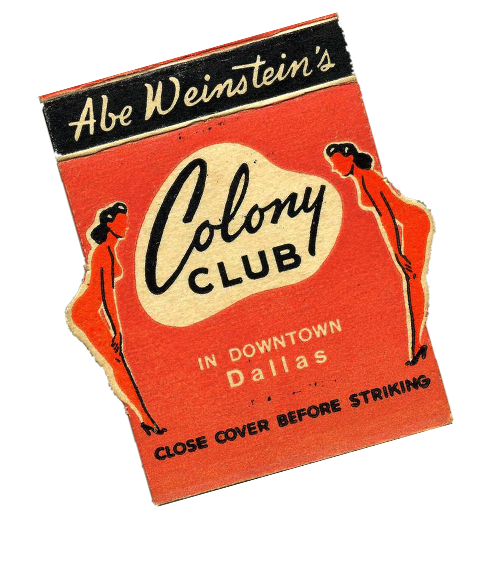
Brand Collateral
Sticking with the mid-century retro design aesthetic, the secondary artwork for the branding references the vintage designs found on old match books and coasters from the era. We can’t take full credit for the amazing t-shirt concept, as that goes to Brand Director Trevor Easter. We did however illustrate his idea and ordered a custom Jesus branding iron that he uses on random guests’ steaks.
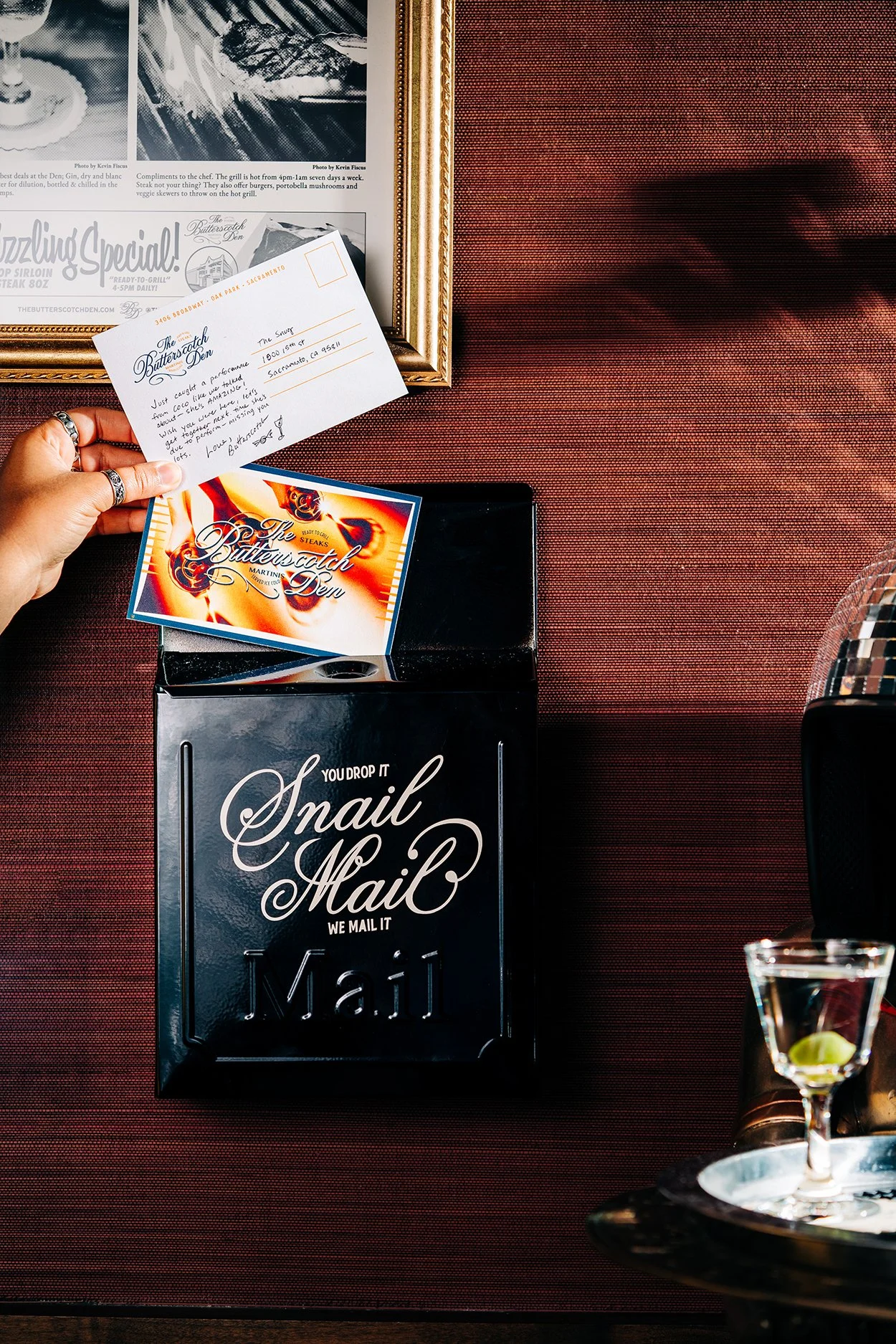


Menus & Coasters
The entire concept is a not-too-serious bar with inexpensive drinks and a food program that encourages guest mingling, so the menu design features artwork and fonts that are loud and playful. We ordered two custom branded covers in marshmallow and ochre (a 4-panel for the bar and a 6-panel for the restaurant) and then designed the pages to fit perfectly. The coasters feature a custom scalloped die-cut reminiscent of mid-century steakhouse napkins and come in three colors: mint, butterscotch and cream.


Social Media
The social media launch was a carefully designed glimpse into the space that covered 12 grid panels. We had kept the flip such a secret that it only felt appropriate to have our initial “landing page” showcase the entire interior and branding as a whole. Our marketing design aesthetic is perfectly captured in this Coco Lamarr graphic, uniting sepia-toned photographs with a collage aesthetic to create something classic.


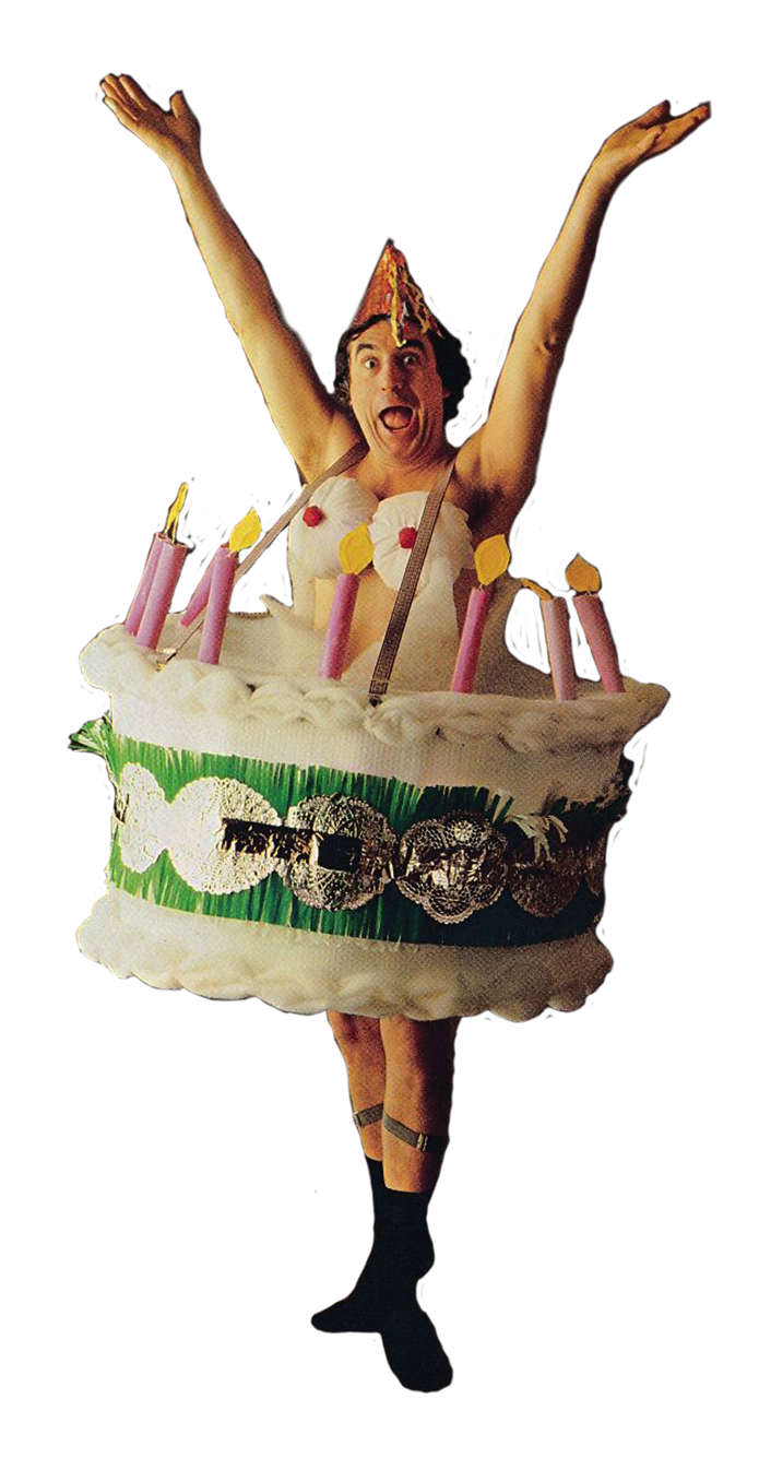
Wall Art
Lastly we have to give a quick shout out to Jane Asher’s “Fancy Dress” DIY Costume Book. We were so inspired by these images that we purchased the vintage book used, scanned the photos at high-resolution, then printed and custom framed our favorites. When you visit, take a moment to walk through the dining room to glimpse at some of the most ridiculous images ever, the butterfly costume is our favorite.