
SACRAMENTO, CALIFORNIADAY TRIPPER
Day Tripper was conceived as an escape hatch in the middle of Sacramento — a place where the daily grind dissolves the moment you walk in and the first sip hits. Working with Irish Hospitality, the goal was to build a space that felt like the best bar you've ever stumbled into on a trip abroad — transportive, warmly unfamiliar, and immediately comfortable. No passport required. The positioning was clear from the start: jet-setter spirit, Jetta budget — aspirational without exclusivity, adventurous without being academic.
Get Lost ~ Serving Vacation Cocktails Daily
PROJECTConcept Development
Brand Positioning & Narrative
Interior Design
Space programming & layout strategy,
Interior Architecture Design Plans,
Design & Aesthetics, Custom Fabrication,
FF&E Sourcing, Project Execution
Brand Identity
Logo, Brand Marks, Font + Color Palette,
Marketing Direction, Brand Voice
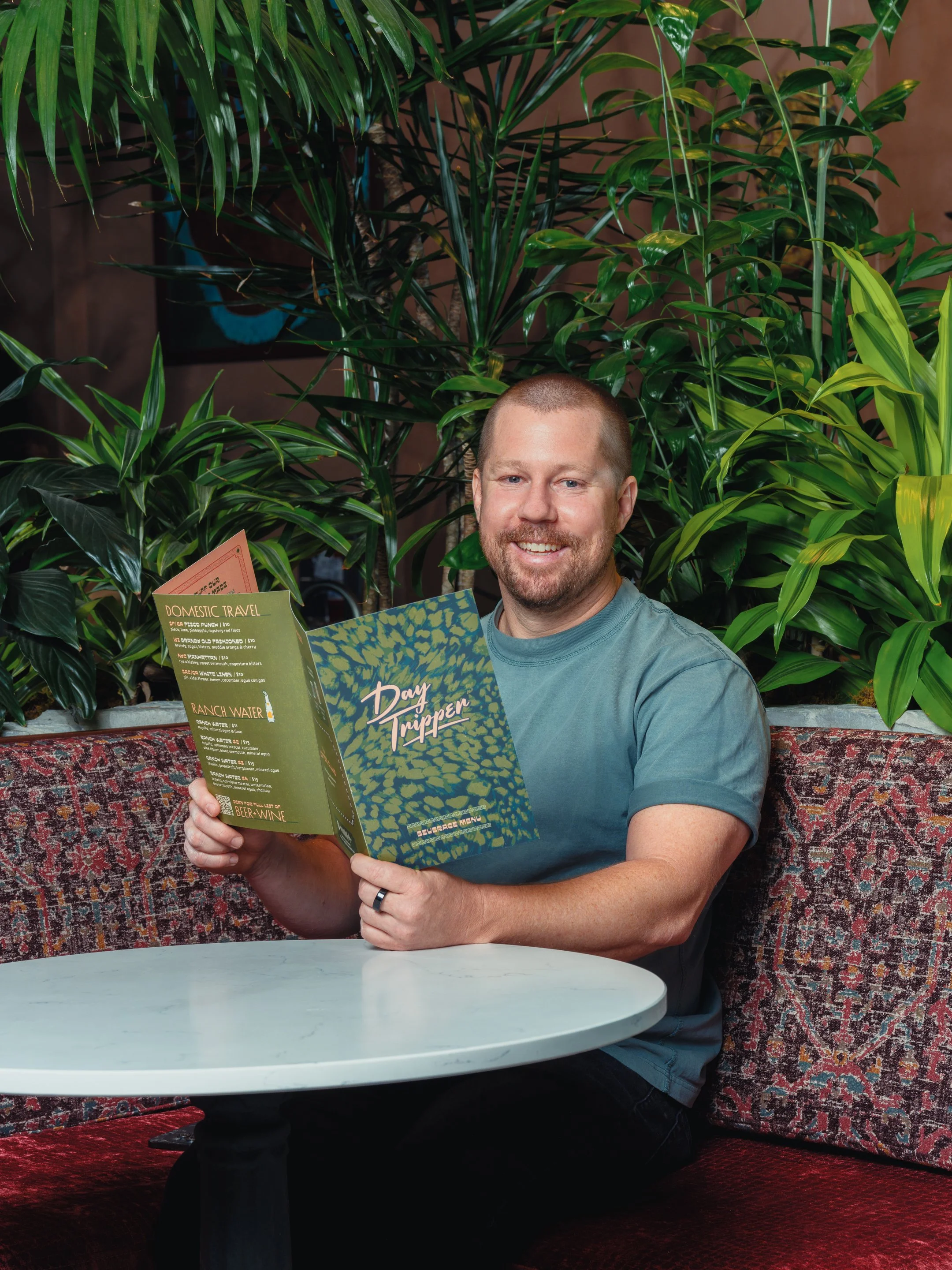
Menu Design
Guest Touchpoints
Coasters, Glassware Wraps, Matchbooks
Merchandise
Hotel Keychains, Striped Cabana Button-Ups
PHOTOGRAPHYPARTNERS
CONCEPTUAL MOOD BOARD


Interior Design
We wanted to capture that feeling of when you take that first sip of a cocktail to start your vacation, so we created the feeling of a hotel bar in a city you've never been to but immediately love — the kind of place with a back bar full of bottles you don't recognize, warm lighting, and the sense that something interesting is about to happen. The design pulled from the visual culture of Latin and Central American travel — patterned tile, tropical warmth, botanical velvet, the color of late afternoon light in Oaxaca — without becoming a theme park version of any one place. It was a composite of everywhere south of the border and nothing too literally specific.


Sacramento didn't have a dedicated home for Latin and Central American spirits culture. The category — Mezcal, Cachaça, Pisco, Rhum Agricole — was either buried in a back corner of a cocktail bar's menu or presented so seriously it scared guests off. The opportunity was to build a space where the spirits were the destination but the experience felt like a vacation, not a lecture. The interior and brand identity needed to do as much work as the menu — transporting guests somewhere else the moment they crossed the threshold.
Brand Identity
The brand identity followed the same logic — playful and inviting, with enough wit and confidence to signal that the people behind it knew exactly what they were doing. The positioning line said it best: this is for the jet-setter in all of us. The design just made you believe it the moment you walked in.
The identity was never going to live on a logo sheet. For Day Tripper to fully land, every object a guest touched had to be in on it — from the glass in their hand to the person handing it to them. The goal was a brand system that felt cohesive without being a uniform, considered without being corporate. Every object in the system was designed to feel like a piece of the trip worth keeping. The glassware sells out. That's how you know it worked.


The zombie and mai tai glasses are the clearest expression of the brand in three dimensions — and the fact that guests buy them to take home is the point. Each glass wraps the Day Tripper logo across a dense tropical botanical or animal print pattern, printed in a palette pulled directly from the space: deep jungle greens, warm terracotta, and copper. They look like souvenirs from somewhere you actually want to go. On the bar they're functional; on a shelf at home they're a reminder that the trip was real.


The cabana-style striped button-up with a branded patch and the dark waxed canvas apron with embroidered Day Tripper script were designed as a system, not an afterthought. Together they read as effortlessly put-together — the kind of staff uniform that feels like a natural extension of the space rather than a costume. The stripe references resort and travel without spelling it out. The apron grounds it — workwear credibility that says the people behind the bar know what they're doing.
The menu covers carry the same tropical botanical wrap as the glassware — dense, layered, richly colored — tying every touchpoint in the guest experience into a single visual language. Whether a guest is holding a drink or reading the menu, they're holding the same world.
