
Ro Sham Beaux
LOW/NO A.B.V. BAR
Client: Irish Hospitality
Location: Sacramento, CA
Let’s face it, wine can be intimidating; that’s why the team at Irish Hospitality recognized an opportunity to bring all natural craft wines to Sacramento in the way they serve up hospitality ~ full approachability. We were hired to bring this concept of natty wine to life in both the Graphic Identity AND our very first Interior Design project.
DELIVERABLES
Interior Design
Visual Brand Identity
Menu Design
Website
Marketing Collateral
Coasters
Table Signs
Photography:
Anna Wick Photography

INTERIOR DESIGN
The interior space sits within a larger building previously used as a mechanic shop. We were given the option to start with a blank canvas or embrace the history of the building, so we opted to incorporate the underlying brick wall as the starting point in this interior design. We used milled cedar planks to line the bar front and entrance, referencing wine barrel staves, along with a wood-chip terrazzo inlay on the bar and table tops.

BRAND IDENTITY
Composed of 3 key elements, the main logo for this wine bar combined the name “Ro Sham Beaux,” rays of sunlight and the icons from the game “Rock, Paper, Scissors.” The inspiration behind the concept pulls from the idea that for most, choosing a wine can result in the nonsensical act of “eeny, meeny, mini moe,” but our badge logo mimics the artwork depicted in palm-reading, offering guidance to our guests that we will help them select delicious wines every time.

Design Collateral
The Brand Identity carries over in the the menu and small pieces of design collateral. With both counter service and digital menus for covid safety, we designed custom cards for guests to use as order numbers and for access to the online menu. The branding was also applied to custom coasters, the deli paper seen above and an ice stamp to capture the brand identity in most guest experiences (and the photo opportunities that may follow).

SIGNAGE
The Rock, Paper Scissor hands were gold leafed by local artist John Dozier on the 3 main windows. We didn’t want the exterior of the space to be a loud advertisement, but mores a cryptic nod to the concept that feels special for those who are “in the know.” Addam Raegan custom designed the banquettes to offer storage beneath the bench seats, and we sourced fabric and designed horizontal cushion rolls that help elongate the seating horizontally to make the space feel larger. The cedar planks were also applied to the base of the banquettes to create visual height and guide the eye upward.


SECONDARY ARTWORK + MARKETING
The artwork we used on the website and across social media is extremely playful and graphic, staying on the concept of approachability and not being too stuff ~ cuz drinking wine doesn’t need to be boring.

Wino Wrestling Federation
WINE CLUB BY RO SHAM BEAUX
Client: Irish Hospitality Group
Location: Sacramento, CA
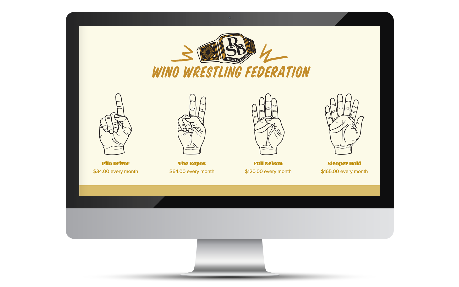
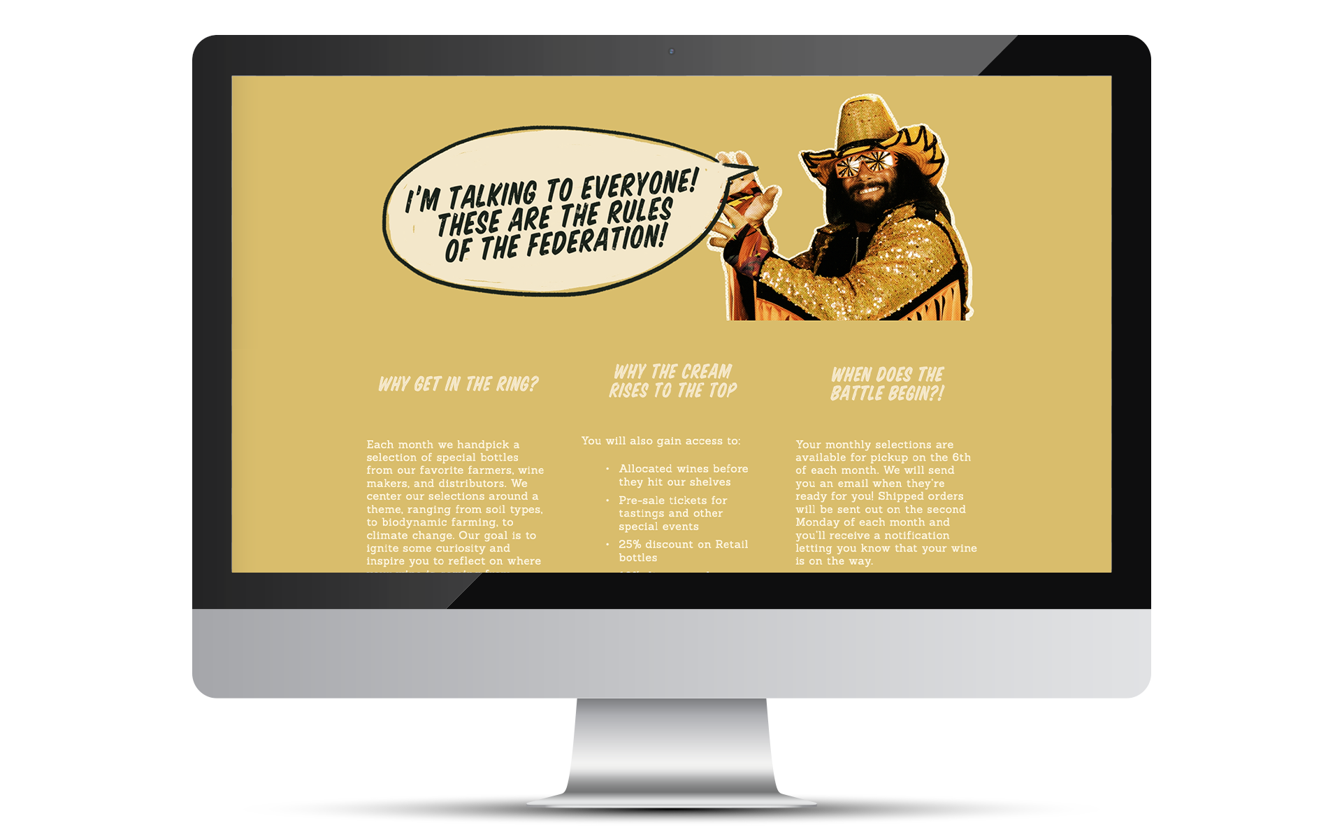
I’ve been a member of this wine club since day 1. It’s so refreshing to receive hand-selected bottles of wine in the mail that I know will be deliciously reliable, especially as a quick grab to take to dinner parties. The team didn’t want the Wine Club Brand Identity to shift too far from the main branding, but desired a somewhat non-sensical concept to make the club fun. Alas, the WWF (Wino Wrestling Federation) a nod to the early era of the Professional Wrestling Stage. Each monthly subscription comes with hand-picked bottles, a tasting note card to access curated monthly wine notes online and a 10% discount on all wine at the bar!

CROSS OVER BRANDING
In order to tie the two brand identities together, we utilized some similar design elements; the most obvious being the color palette and illustration style. However our very favorite design element is the hands for the Club Membership tiers, especially the “Sleeper Hold” which is depicted as a 6-finger hand.